
Highlight: Automated Documentation
https://youtu.be/_zTgmu7Yf7o"How did you come up with that number?"Whether we're talking about life or data, trust is something that's earned. With trust comes confidence. Our new drillable Auto Documentation feature helps gain trust and build confidence in your data by showing you how it was calculated. You're no longer presenting numbers you pulled out of a black box or trading numerous emails with your data team to verify calculations. It's right there for you at the click of a button, on every chart!
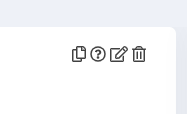
How It WorksClick the question mark icon in the upper right corner of a chart.
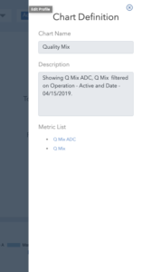
(click image to enlarge)
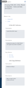
A Chart Definition window will slide open and show you the Chart Name and Description of the calculation used to create the chartA Metric List is below the Description, with links that let you drill down into each metric and see their definition. You can drill down to the root definition of any metric.
(click image to enlarge)
Sticky FilterAnother new feature we've added is the "Sticky Filter." This one is a time saver. In a nutshell, when you update a filter to show data on a particular building, this will be "remembered" as you switch to other charts. If you're interested in analyzing a specific building, you can continue that train of thought as you look at different charts and dashboards. You no longer have to reapply the filter when you change views.
(click image to enlarge)
One of our main tenets at DashboardHC is to empower companies and employees with data tools that help level the playing field in the Skilled Nursing Facility and Post Acute Care industry. We are focused on innovating and developing these tools to make our clients successful.
See the platform today.
DashboardHC has come a long way since this post was written. Today we connect your operations data to the AI tools your team already uses.